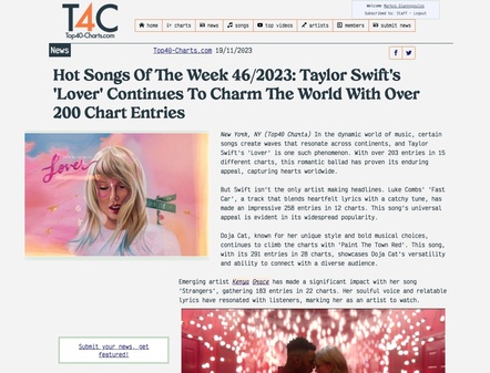
New York, NY (Top40 Charts) We've got some exciting (for us, at least!) news to share - our site has an updated, fresh new look, and we hope you will like it. We've revamped the visuals and layout to make it more engaging and easy to read. Here's a quick peek at what's new and why we're so excited about it:
What's Changed?
Layout and Design: We have made subtle adjustments to the Homepage and News sections for a cleaner, more modern design. We've evolved the layout on desktop screens to make the information more accessible and pleasant to read. This means less clutter and more focus on what's important—the content!
Typography: We've also updated the typography to be more reader-friendly on both desktop and mobile screens. The new fonts are not only stylish but also easier on the eyes, making it a breeze to scan through our tips and tricks for boosting your music career. Our new fonts set consists of Victor Mono by Rune Bjørnerås and Creolia by Milan Pleva.
Colour Scheme: Our new design features the same T4C classic colour scheme with small adjustments in colour use in a more user-friendly and engaging way.
Why These Updates?
We want Top40-Charts.com to be your go-to resource for all things music, and that includes providing you with the best possible experience. With these updates, we aim to make learning about music promotion not just informative but also enjoyable. Whether you're a seasoned artist or just starting out, our site is here to help you navigate the evolving world of music with ease.
We Want to Hear from You
As we roll out these exciting changes, we'd love to hear your thoughts. Your feedback is crucial in helping us continually improve and ensure that we're meeting your needs. So dive in, explore the new site, and let us know what you think!
We're so grateful for your continued support and enthusiasm. Thanks for being a part of our community, and here's to making your musical dreams come true with a little help from your friends at Top40-Charts.com!
| 


